
I developed CertiSuite’s brand identity and visual design for a compliance management platform, spanning its website, dashboard concepts, investor presentations and marketing materials. A distinctive nine-pointed seal and navy-and-yellow palette connect the work, while clear information hierarchy makes complex compliance processes easier to understand.
Brand Identity
At the heart of the CertiSuite identity is a distinctive nine-pointed seal, inspired by symbols of certification, quality and trust. Its recognizable shape communicates confidence, credibility and the platform’s purpose before a single word is read. Paired with a sophisticated navy and yellow colour palette, the identity reinforces CertiSuite’s mission of simplifying compliance while establishing a cohesive visual language across digital platforms, corporate communications and marketing materials.


Website Design
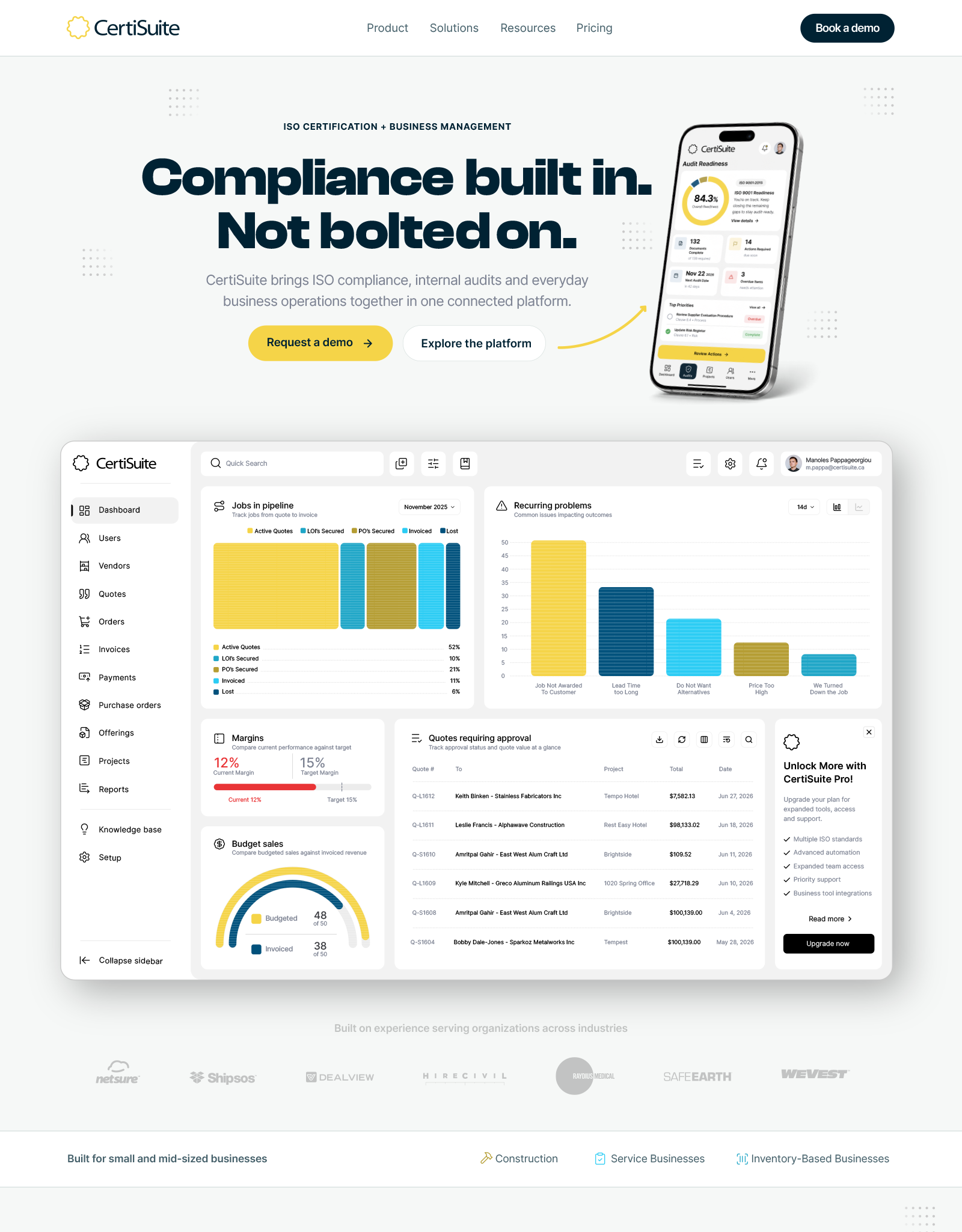
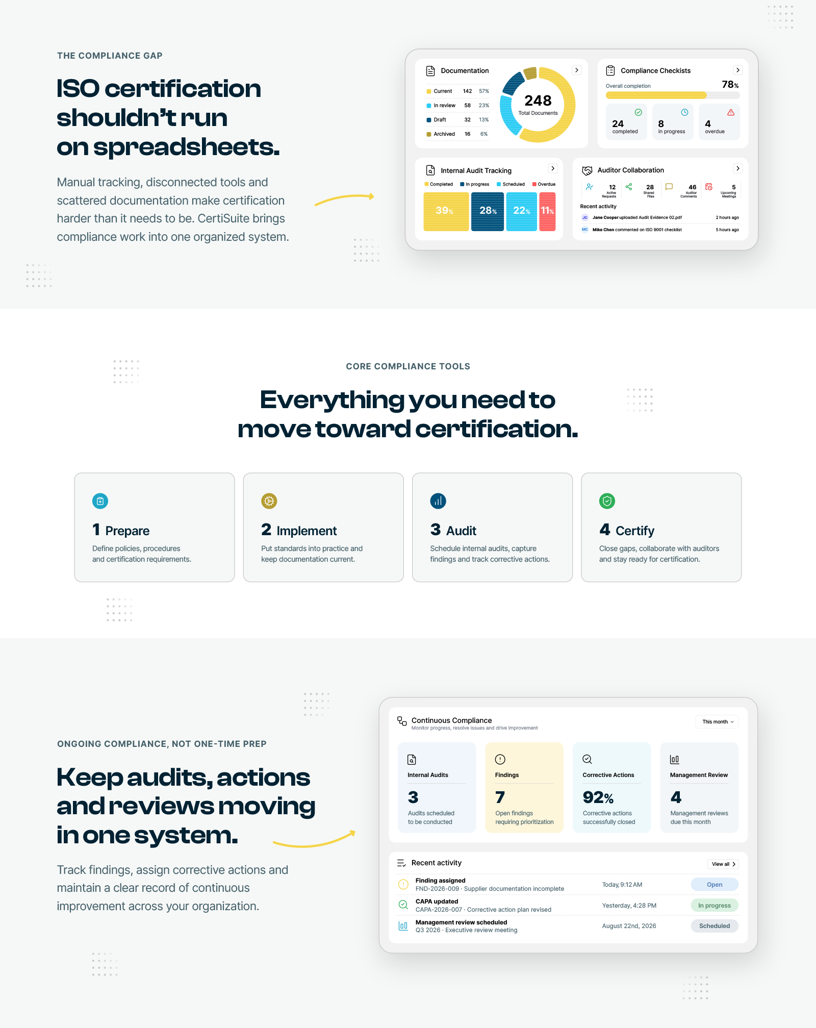
The CertiSuite website was designed to deliver a premium, sophisticated experience while guiding visitors toward conversion. Confident typography, generous white space and meticulous details, including subtle dotted backgrounds, yellow directional arrows and refined visual accents, establish a clear visual hierarchy and lead users toward key calls to action. Rather than relying on generic AI-generated mockups, the design incorporates actual, pixel-perfect dashboard screens and interface views, presenting the product with authenticity and precision while reinforcing its value and encouraging engagement.


Dashboard & Product Design
A comprehensive redesign of the CertiSuite dashboard, transforming a functional but dated interface into a cleaner, more intuitive and visually cohesive experience. The redesign introduces refined navigation, improved information hierarchy, modern data visualizations and a consistent system of cards, controls and interface elements. Every screen was meticulously designed to balance usability, visual clarity and the platform's broader brand identity, demonstrating how thoughtful design can make complex business information more accessible.
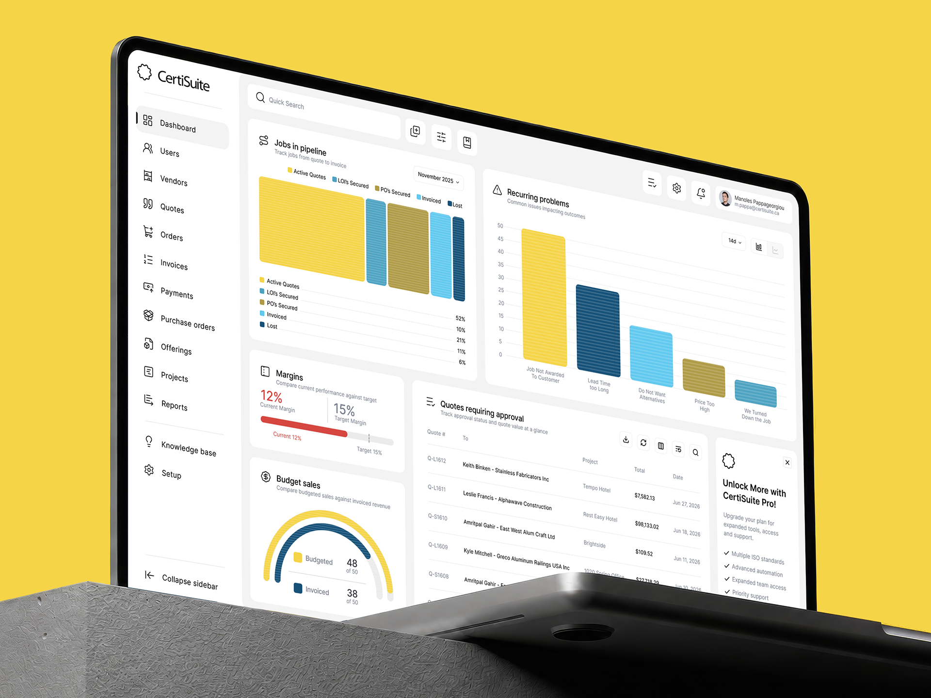
The original dashboard (left) was based on largely out-of-the-box software. Although I made incremental improvements over the years, its underlying design remained largely unchanged. The redesigned dashboard (right) was conceived entirely from the ground up, preserving all existing functionality while rethinking every detail. From navigation, typography and spacing to data visualization, colour, icons and individual interface elements, every aspect was carefully refined to create a cleaner, more intuitive and visually cohesive experience.
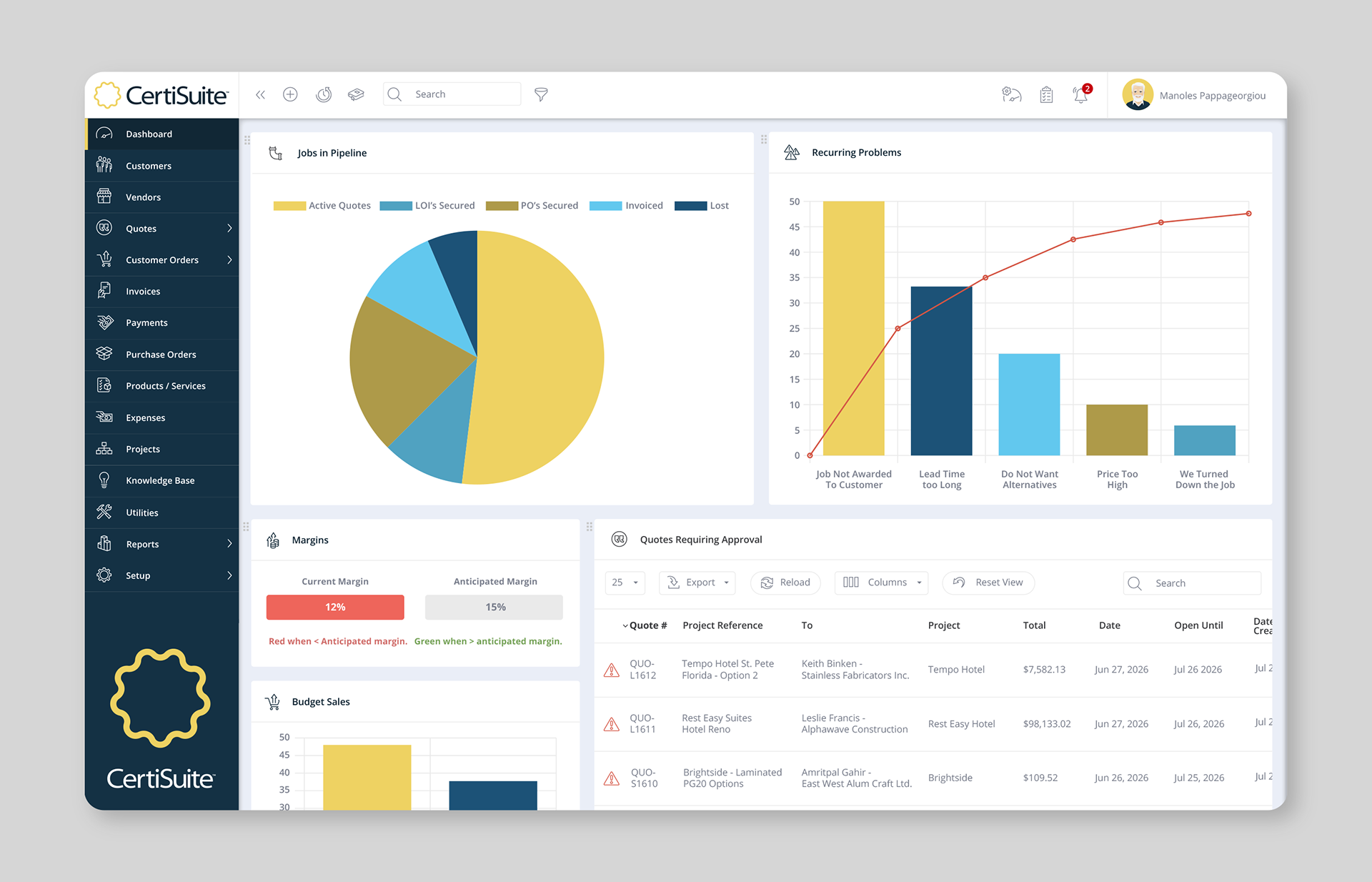
Original Dashboard Design

Redesigned Dashboard Concept
Corporate Communications
A comprehensive suite of corporate communications designed to translate complex business concepts into clear, compelling visual narratives. From investor presentations to a detailed 55-page business plan, the materials combine strong editorial design, structured information hierarchy, data visualization and consistent branding. Every element was carefully considered to communicate professionalism, build confidence and present the CertiSuite business opportunity with clarity and impact.
The pitch deck and business plan were developed during an earlier phase of the project, before the website and redesigned dashboard were finalized. As a result, some materials feature preliminary interface concepts and earlier dashboard designs, offering a glimpse into the evolution of the CertiSuite visual identity and product experience.

CertiSuite Corporate Pitch Deck
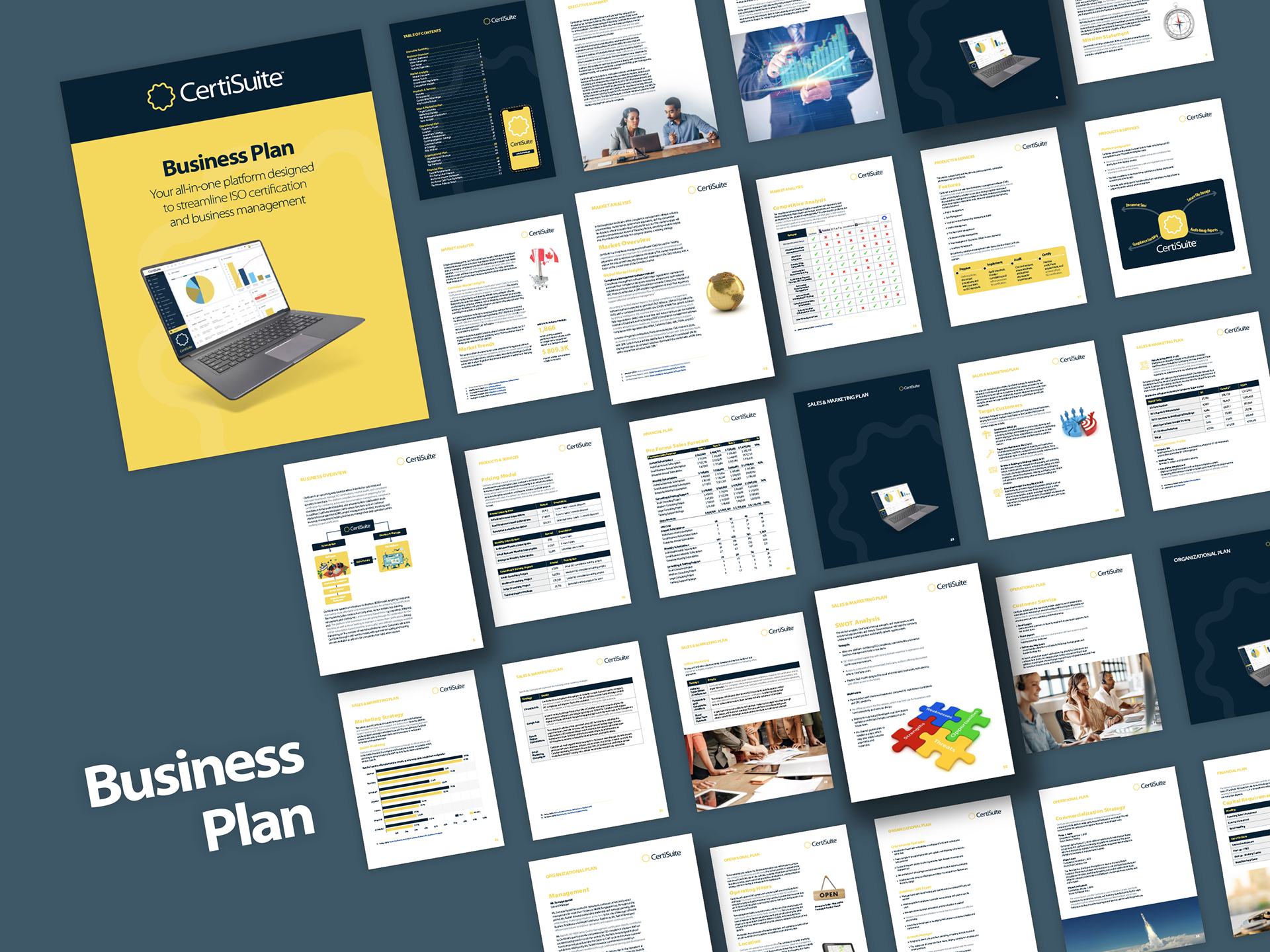
CertiSuite Business Plan Booklet
Outdoor Advertising / Billboard Concept
A bold, high-impact billboard concept built around CertiSuite's core promise: “Simplify Compliance. Anywhere.” Strong typography, dramatic lighting and a vibrant navy and yellow colour palette create immediate visual impact, while the smartphone imagery reinforces the platform's accessibility and ease of use. Designed for quick recognition at a distance, the composition communicates the brand's value with clarity, confidence and minimal distraction.


