I developed the brand identity, website design and business communications for Prioritywise, a B2B project management platform. The geometric logo, green-to-teal accents and dark website aesthetic establish a recognizable identity across product visuals, investor presentations, publications and advertising concepts.
Brand Identity & Digital Applications
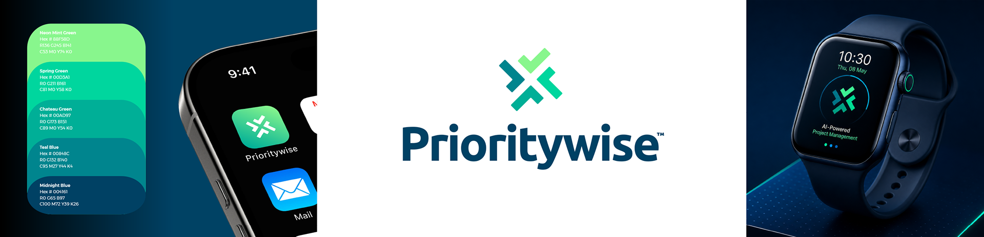
The Prioritywise identity centres on a distinctive geometric symbol suggesting connection, coordination and forward momentum. Its interlocking forms and vibrant green-to-teal palette create a recognizable visual signature that works equally well at large and small scales. From the primary wordmark to app icons, wearable technology and branded merchandise, the identity was designed for versatility, consistency and immediate recognition across digital and physical applications.

Website Design & Digital Experience
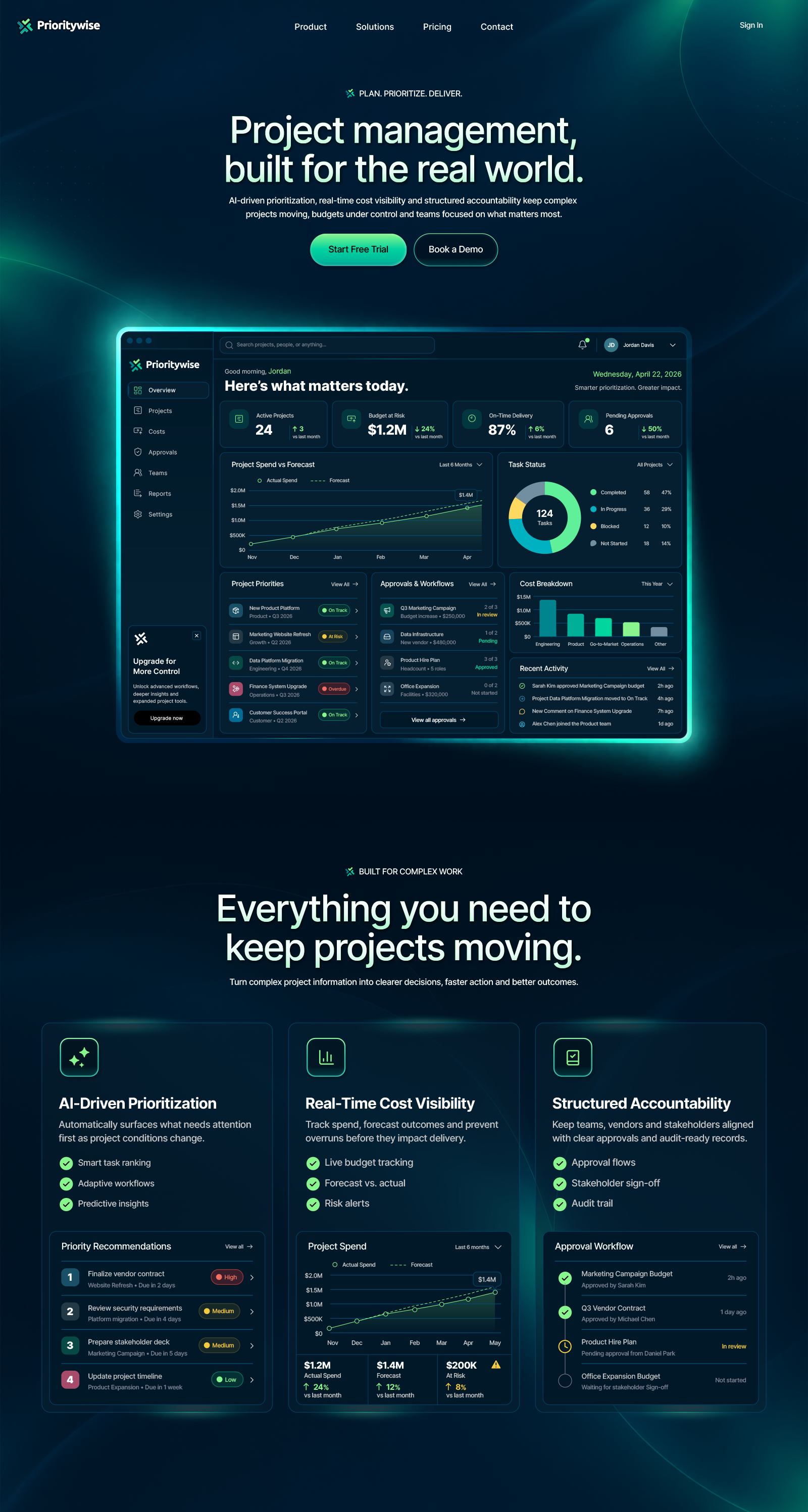
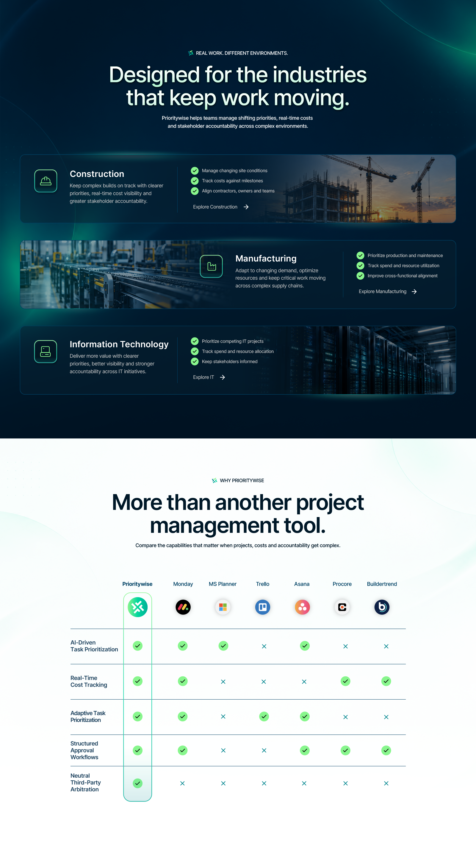
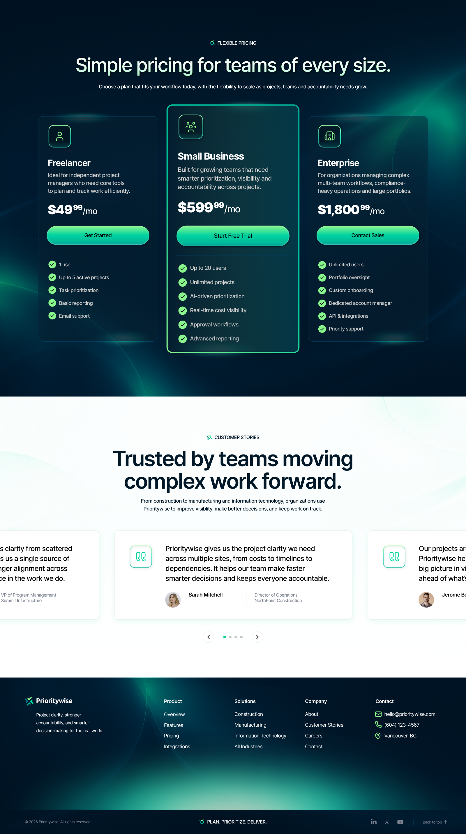
The Prioritywise website combines a sophisticated dark-mode aesthetic with vibrant green accents, subtle lighting effects and carefully structured content to create a premium digital experience. From the dashboard-focused homepage to industry-specific solutions, pricing tiers, feature comparisons and customer testimonials, every section was designed with a clear visual hierarchy, intuitive navigation and conversion-focused calls to action. The result is a cohesive, contemporary website that makes complex project management software feel accessible, powerful and engaging.

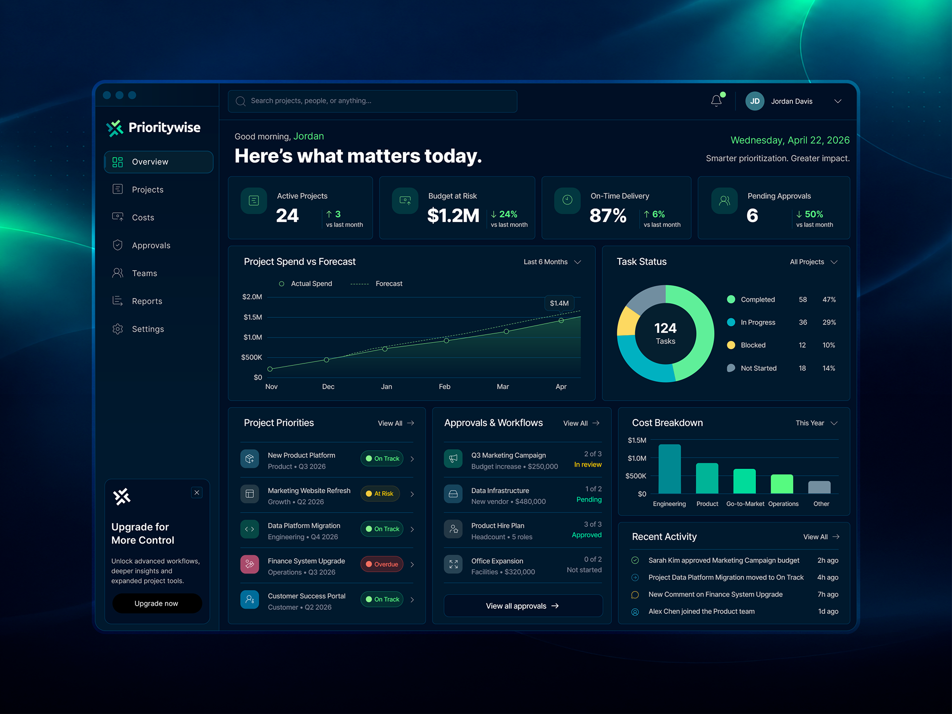
Platform Dashboard | UI Design
The Prioritywise dashboard extends the brand's visual identity into the software itself. A dark interface, carefully organized data, intuitive navigation and clear visual hierarchy bring complex business information together in a streamlined workspace designed for everyday use.
Corporate Communications
A cohesive suite of corporate communications developed to present Prioritywise's business strategy, product capabilities and market opportunity. The investor pitch deck and comprehensive business plan combine structured information design, data visualization and compelling visual storytelling. Consistent typography, bold graphics and the distinctive navy and green colour palette extend the brand identity into polished, professional business publications.

Prioritywise Corporate Pitch Deck
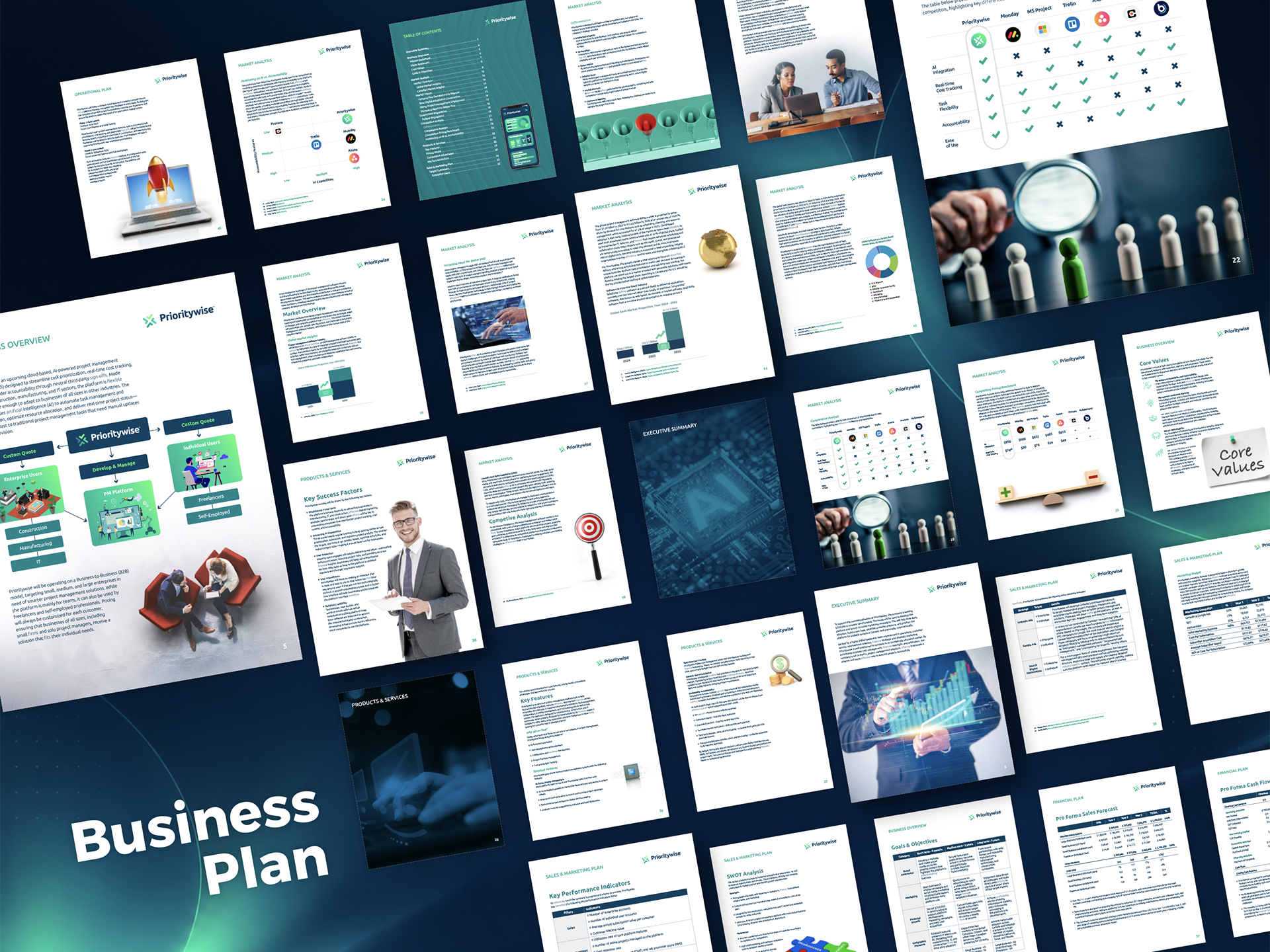
Prioritywise Business Plan Booklet
Advertising & Environmental Branding
Extending the Prioritywise identity beyond digital platforms, these concepts explore how the brand translates into large-format outdoor advertising and dimensional corporate signage. The billboard combines bold messaging, dynamic imagery and vibrant green accents to communicate the platform's value at a glance, while the illuminated reception signage demonstrates how the distinctive logo and visual identity can create a premium, professional presence in a physical environment.
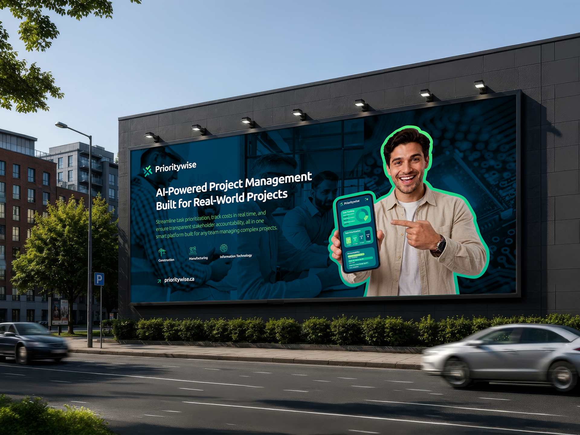
Billboard Advertising
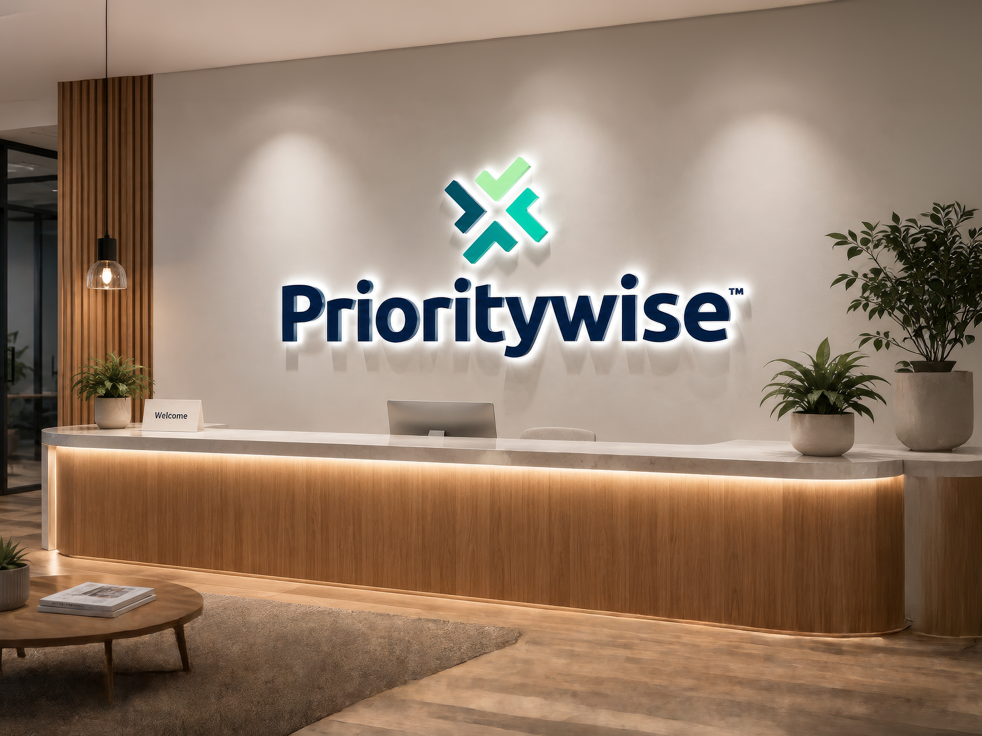
Office Reception Signage