A diverse collection of creative projects spanning website design, brand identity, marketing communications and digital strategy. From established businesses to emerging startups, these projects demonstrate a versatile approach to visual communication, combining thoughtful design, creative problem-solving and consistent attention to detail across a wide range of industries and applications.
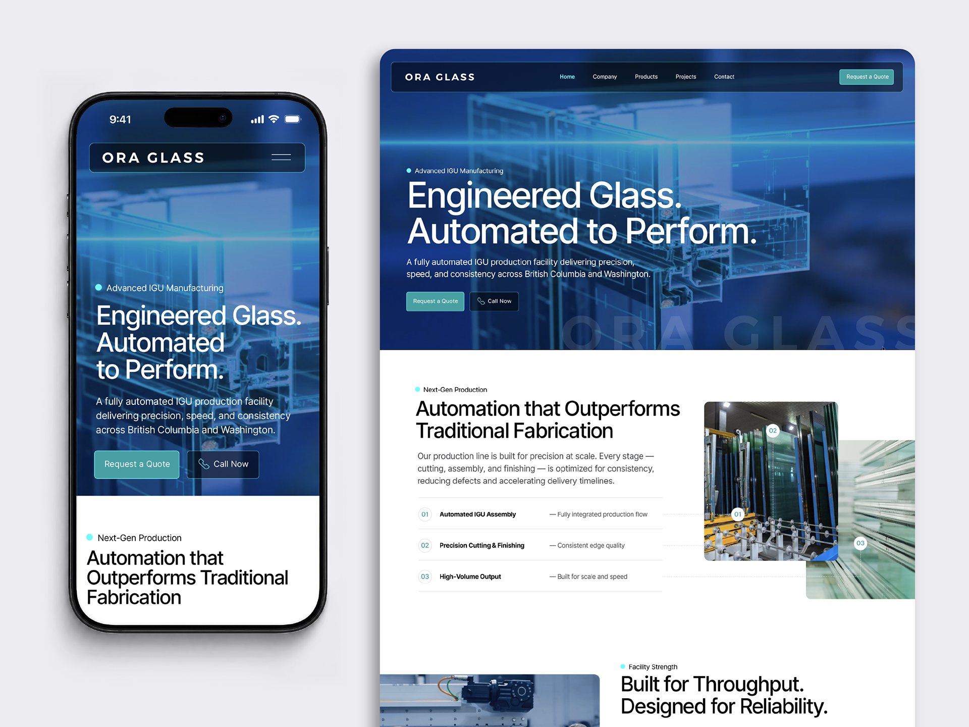
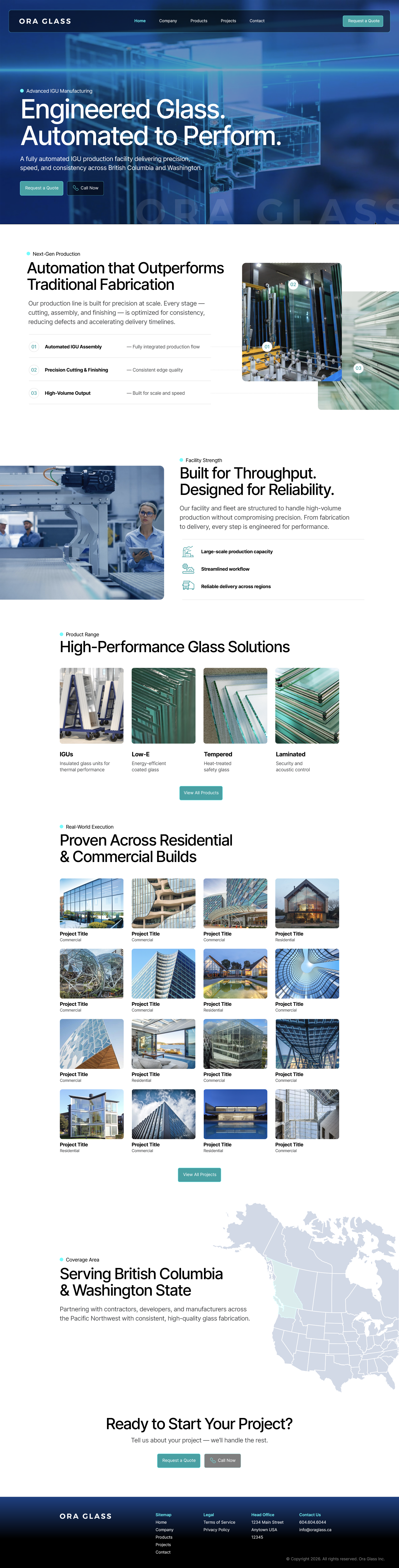
Ora Glass | Website Design & Art Direction
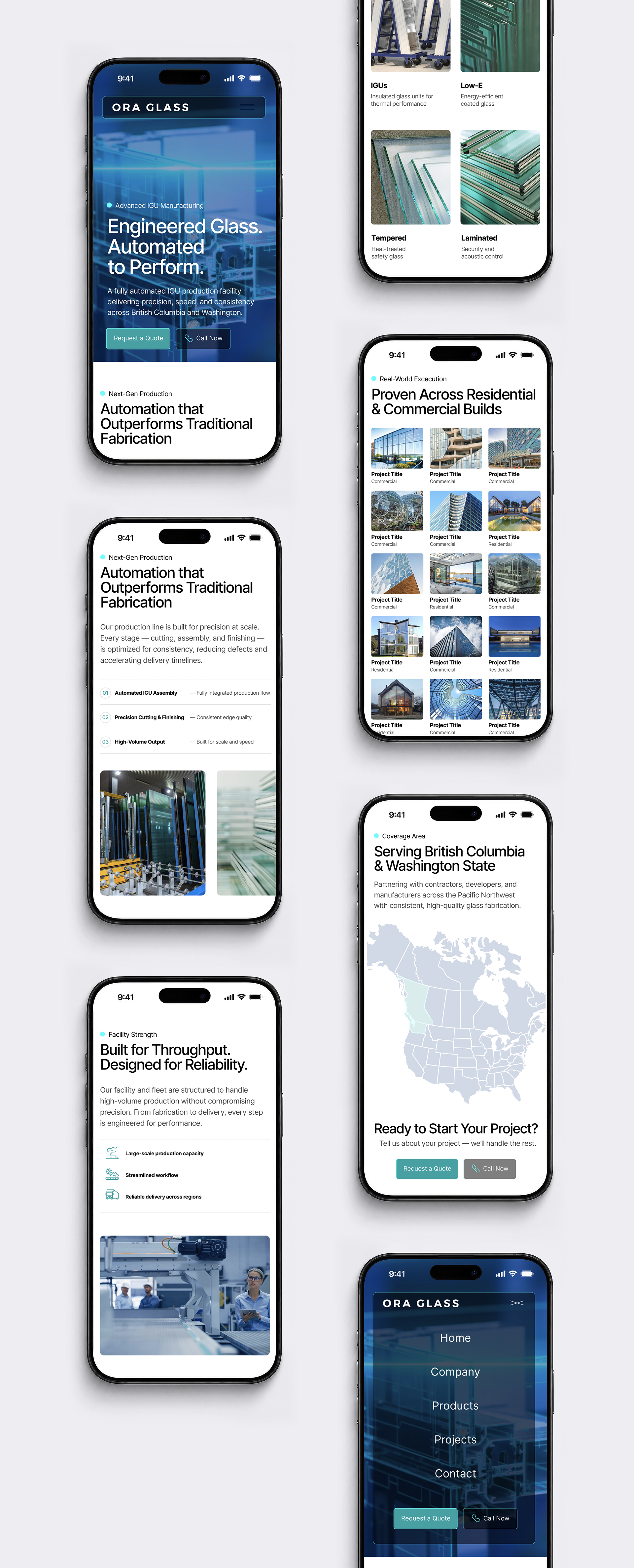
A contemporary website concept for Ora Glass, combining refined typography, architectural imagery and a clean, sophisticated visual aesthetic. The design emphasizes the company's glass products and architectural applications through carefully structured content, elegant layouts and an AI-generated video hero that brings movement and visual impact to the digital experience.
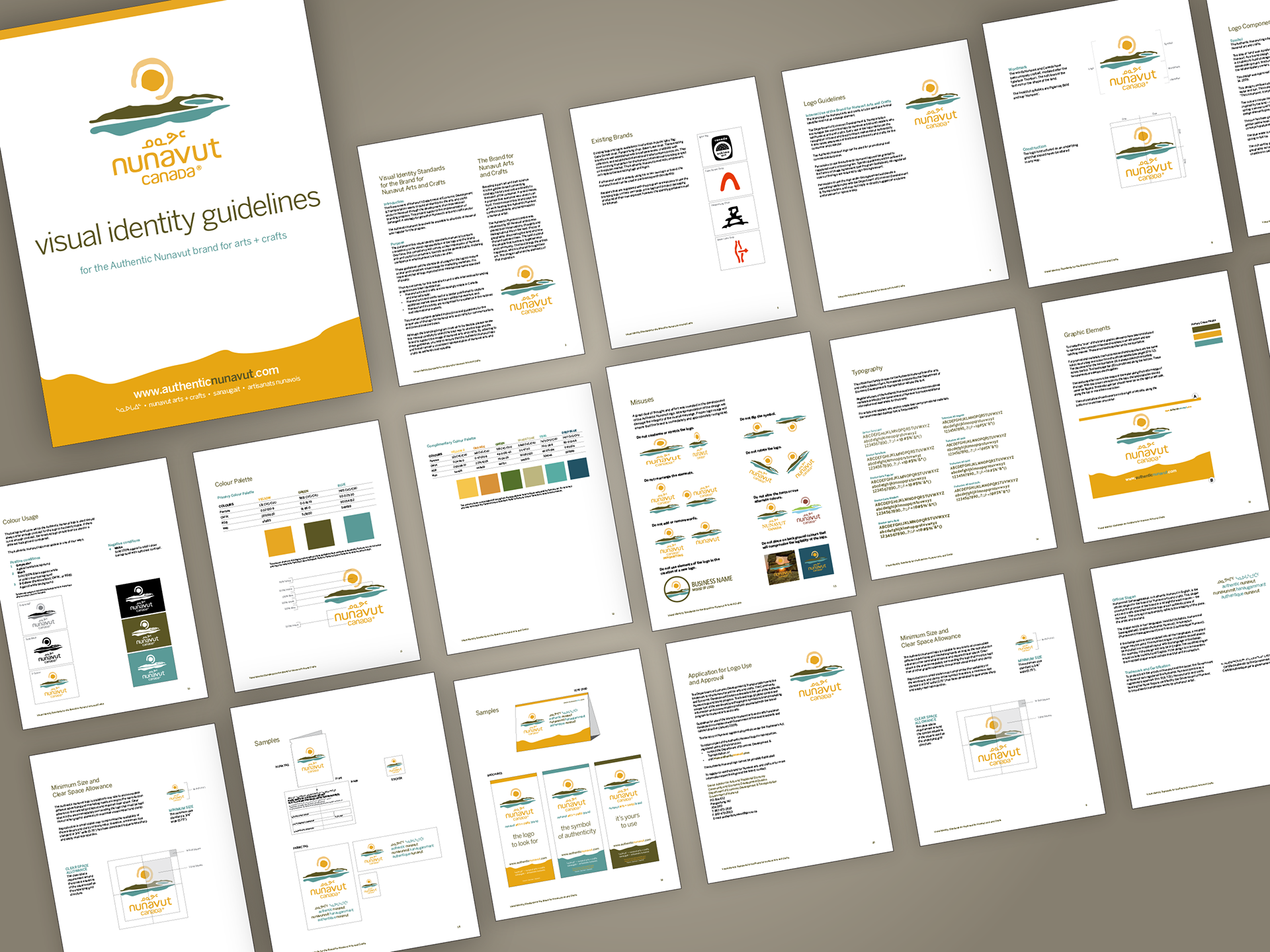
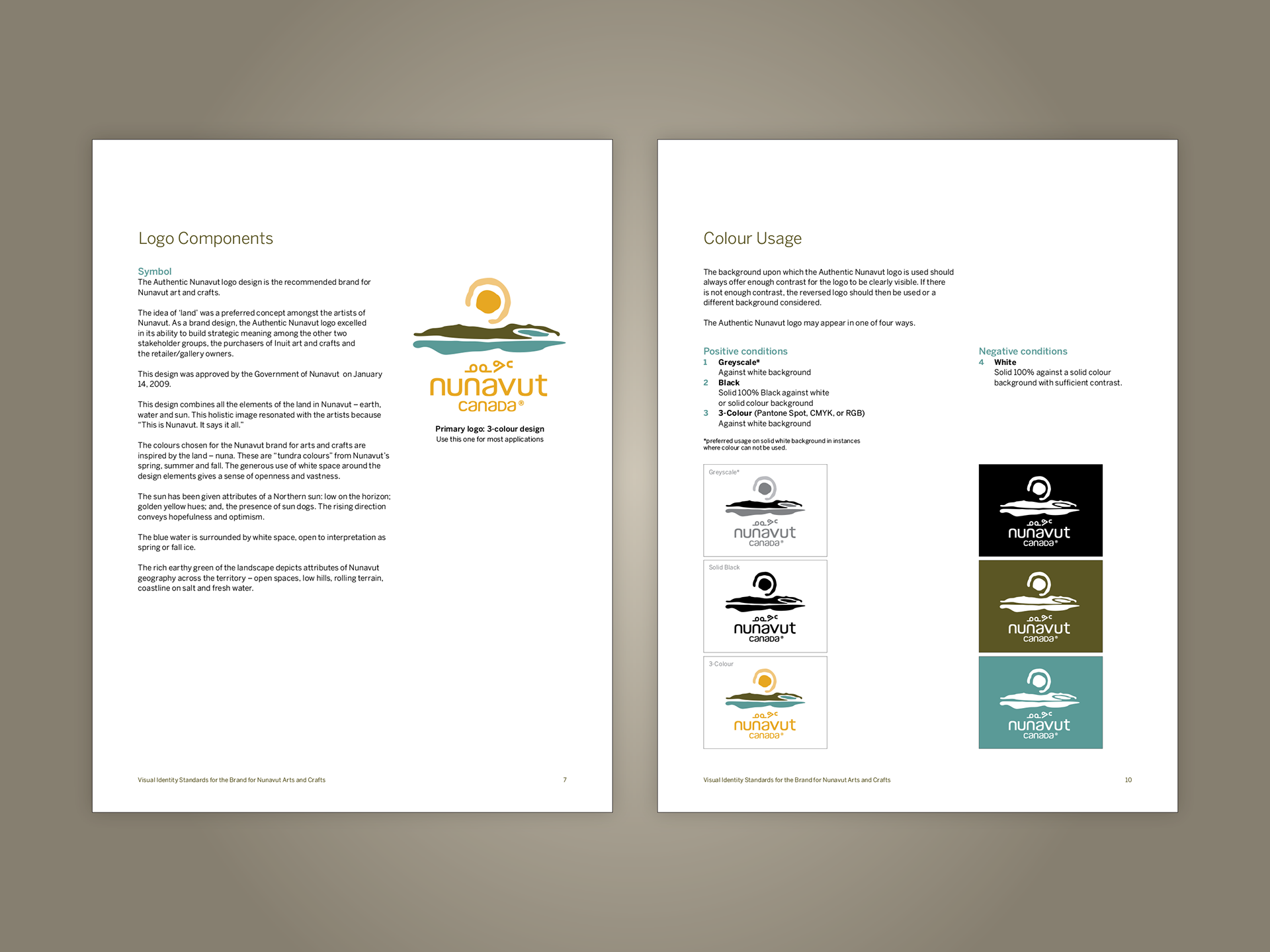
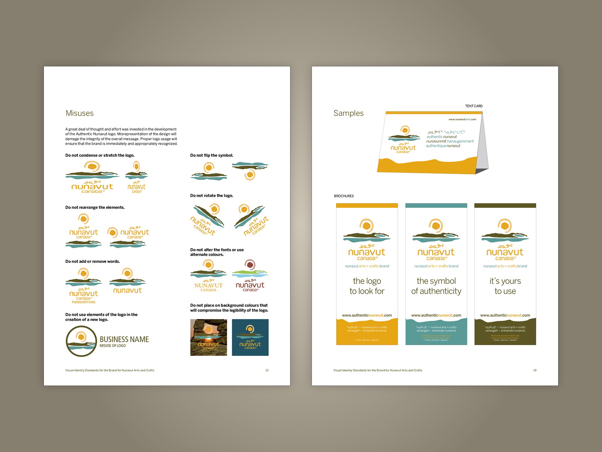
Authentic Nunavut | Brand Identity & Standards
Developed for the Government of Nunavut's Authentic Nunavut arts and crafts initiative, this comprehensive brand standards guide establishes a clear and consistent visual identity for use across promotional, informational and public-facing materials. The guidelines define logo usage, spacing, scale, colour, typography and supporting graphic elements, ensuring the identity remains recognizable across a wide range of applications. A warm, natural colour palette and carefully structured typography complement the artwork and cultural traditions represented by the program. Designed for use by program administrators, participating artists and retailers, the system balances creative flexibility with the consistency needed to protect the integrity of the brand.
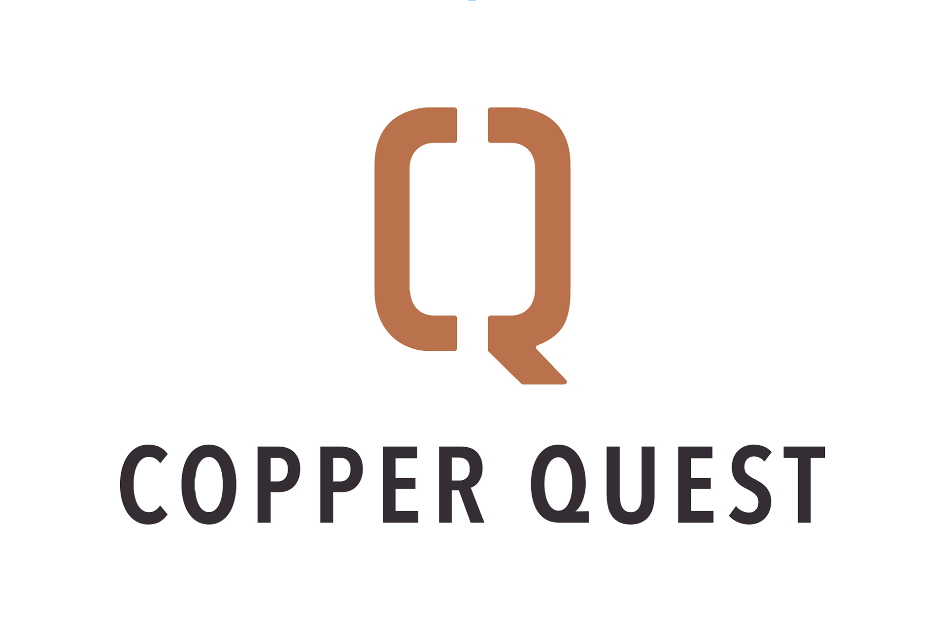
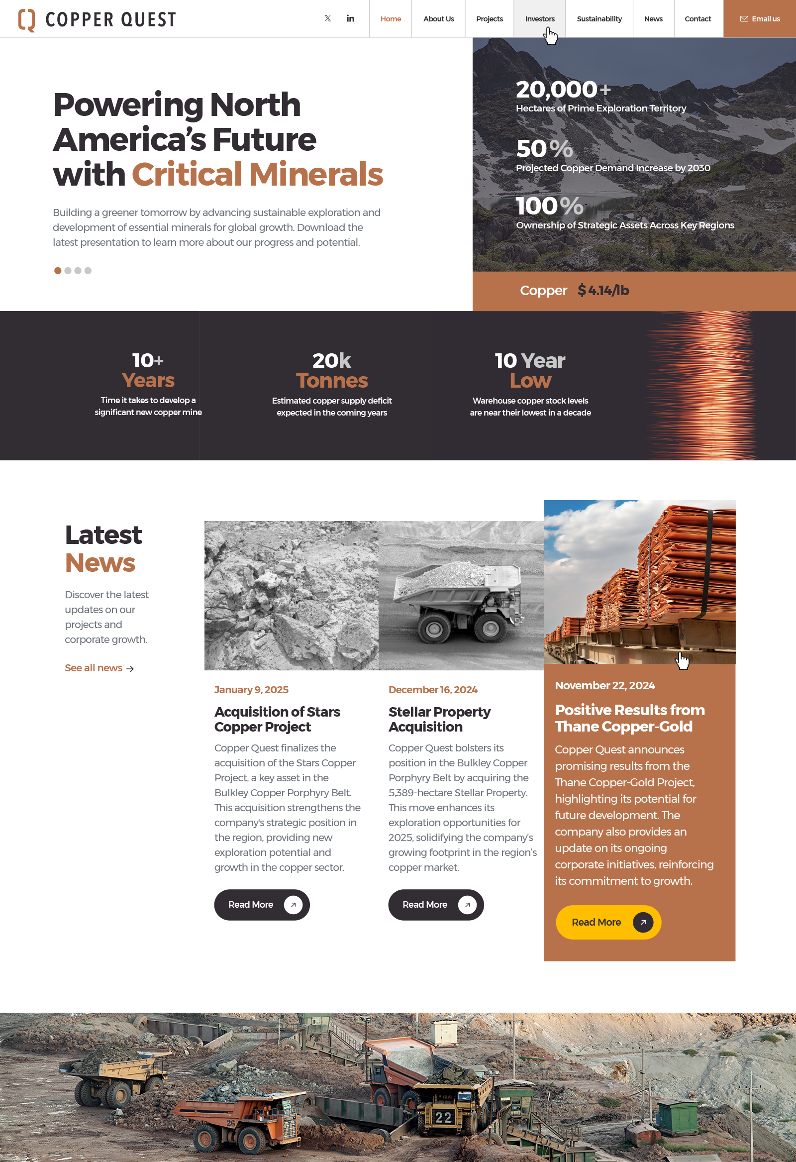
Copper Quest | Logo & Website Design
Copper Quest is a North American mineral exploration company focused on copper, gold and critical mineral development. I created the company's visual identity around a custom geometric monogram combining the letters C and Q into a single distinctive mark. A copper-inspired colour palette, charcoal accents and confident typography establish a strong, investor-focused brand presence.
The website extends this identity through dramatic mining imagery, interactive mapping, project information and a clear, modular layout. Subtle hover-state micro-interactions bring the interface to life, with images transitioning from grayscale to full colour and enlarging slightly on rollover. The result is an engaging digital experience that makes complex exploration information accessible while reinforcing the company's visual identity.


SafeEarth | Website Design & Art Direction
A website designed for SafeEarth, balancing industrial credibility with the company's commitment to sustainability and environmentally responsible operations. An earthy colour palette, expansive forest photography and clean, modular layouts establish an approachable visual identity, while angled section dividers, custom iconography and subtle hover-state micro-interactions bring movement and personality to the experience.
Beginning with an AI-assisted prototype developed in Lovable, I extensively redesigned and refined the website through stronger typography, more purposeful imagery, improved content hierarchy and a more engaging visual flow. The transformation demonstrates how professional art direction can elevate AI-generated concepts into a cohesive, polished digital experience.


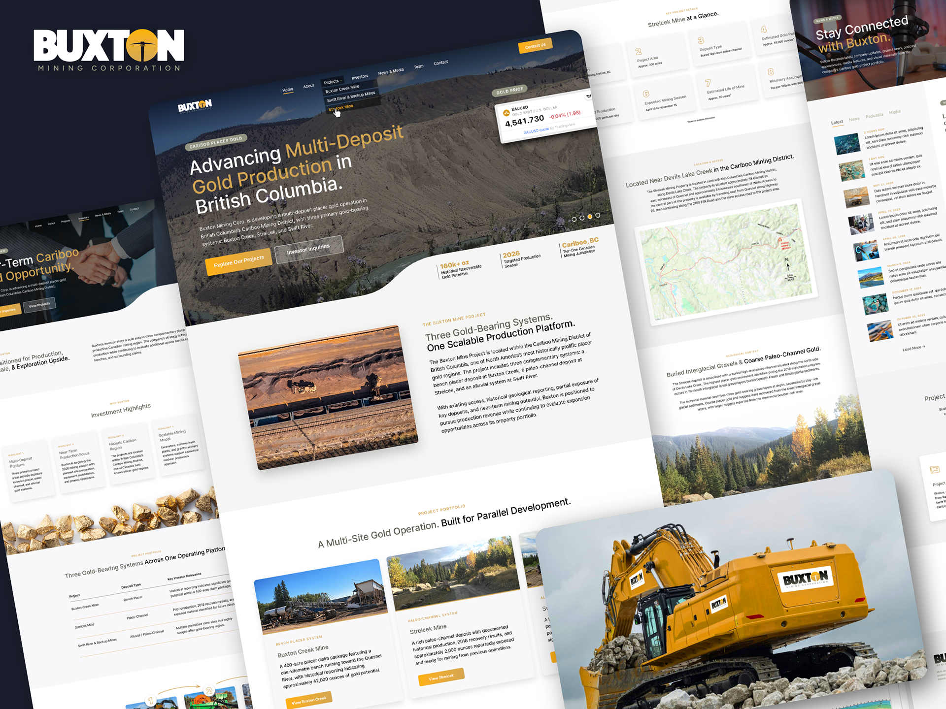
Buxton Mining | Logo Facelift & Website Design
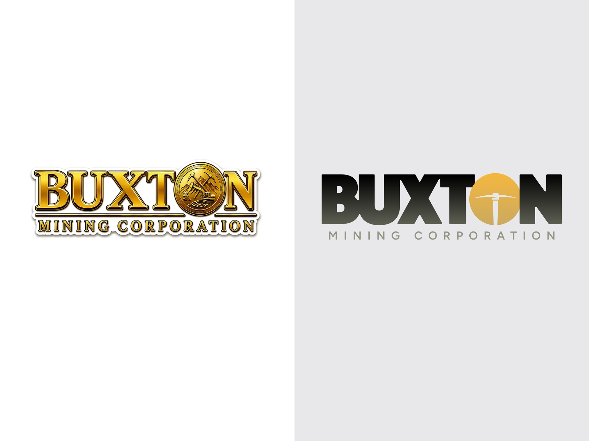
A website and brand refresh developed for Buxton Mining, bringing greater clarity and visual consistency to the company's communications. I refined the existing logo, preserving its established identity while improving its typography, proportions and overall presentation.
The website combines dramatic mining photography, bold typography and a structured visual hierarchy to communicate the company's operations, projects and expertise. A restrained colour palette and clean, modular layouts provide an organized, professional presentation suited to the mining and resource development industry.
Logo Facelift & Alternative Concepts
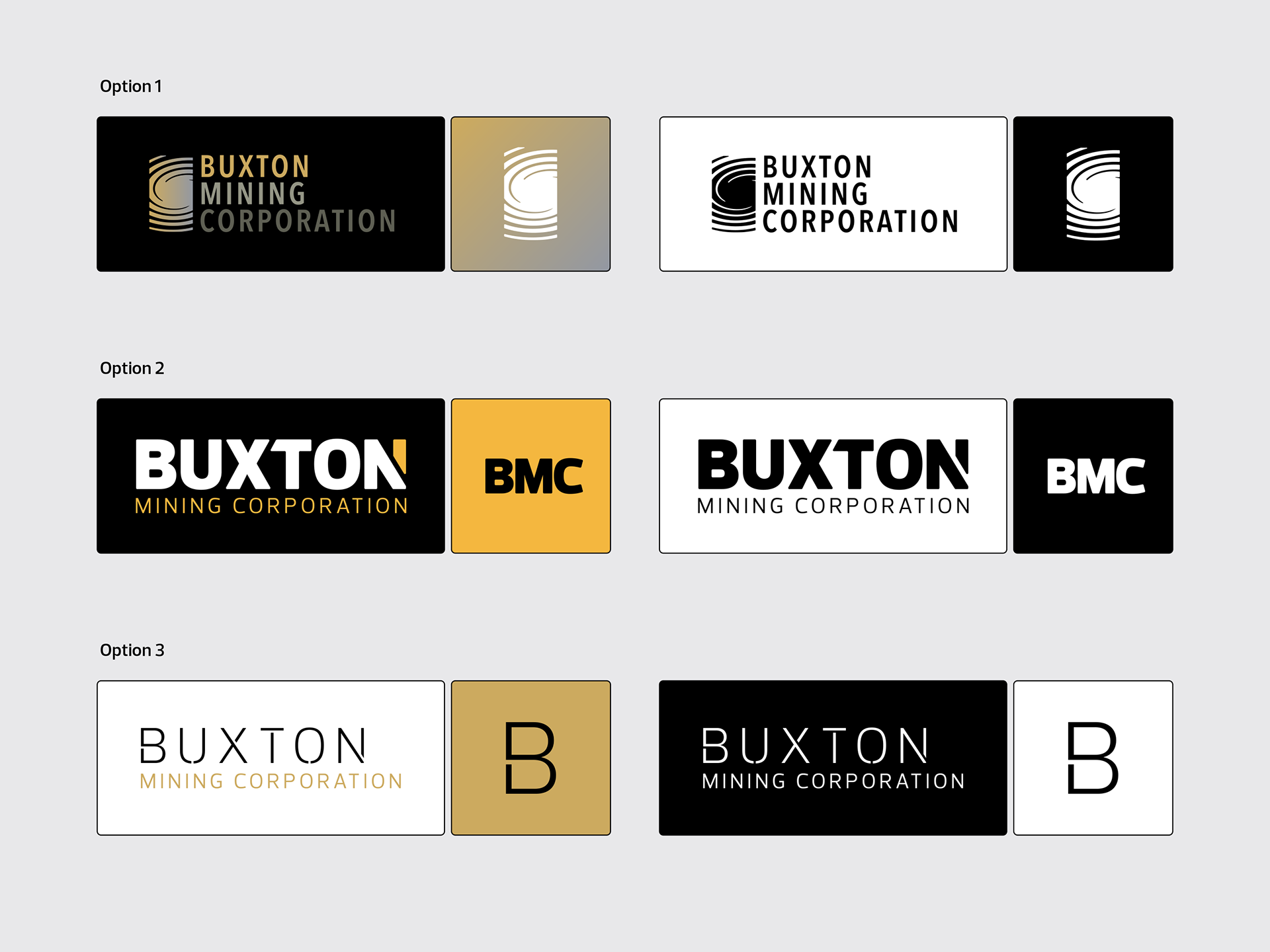
Three distinct identity directions were explored for Buxton Mining, each reflecting a different aspect of the company's business. The first drew inspiration from glacial formations and the geological forces that shaped the region's gold deposits. The second emphasized industrial strength through bold, condensed typography and subtle gold detailing. The third adopted a more refined corporate approach, combining restrained typography with a minimal monogram to communicate stability and long-term growth.
Orbiiit | Website Redesign & Platform Audit
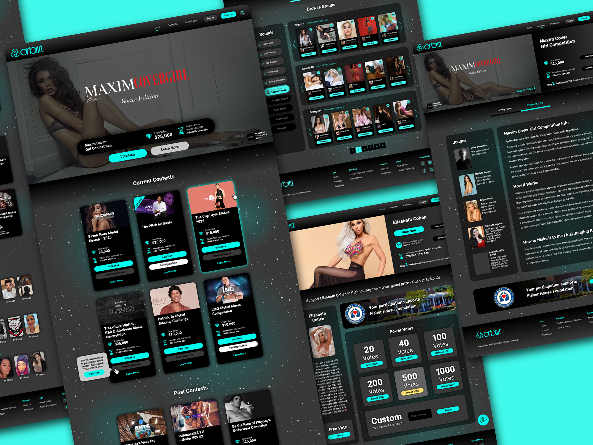
A website redesign for Orbiiit, an online contest platform connecting sponsors, participants and voters. The interface combines a dark, immersive visual environment with vibrant turquoise accents, modular contest cards and streamlined navigation to create a more engaging user experience. Clearer prize information, simplified voting and improved content hierarchy make the platform easier to explore and navigate.
Beyond the website design, I developed an 11-page System Enhancement Audit identifying 13 opportunities for improvement across user experience, performance, navigation, search, sharing and scalability. The document combines detailed recommendations with interface concepts and a strategic roadmap for future platform development.

PolarBot International | Website Design
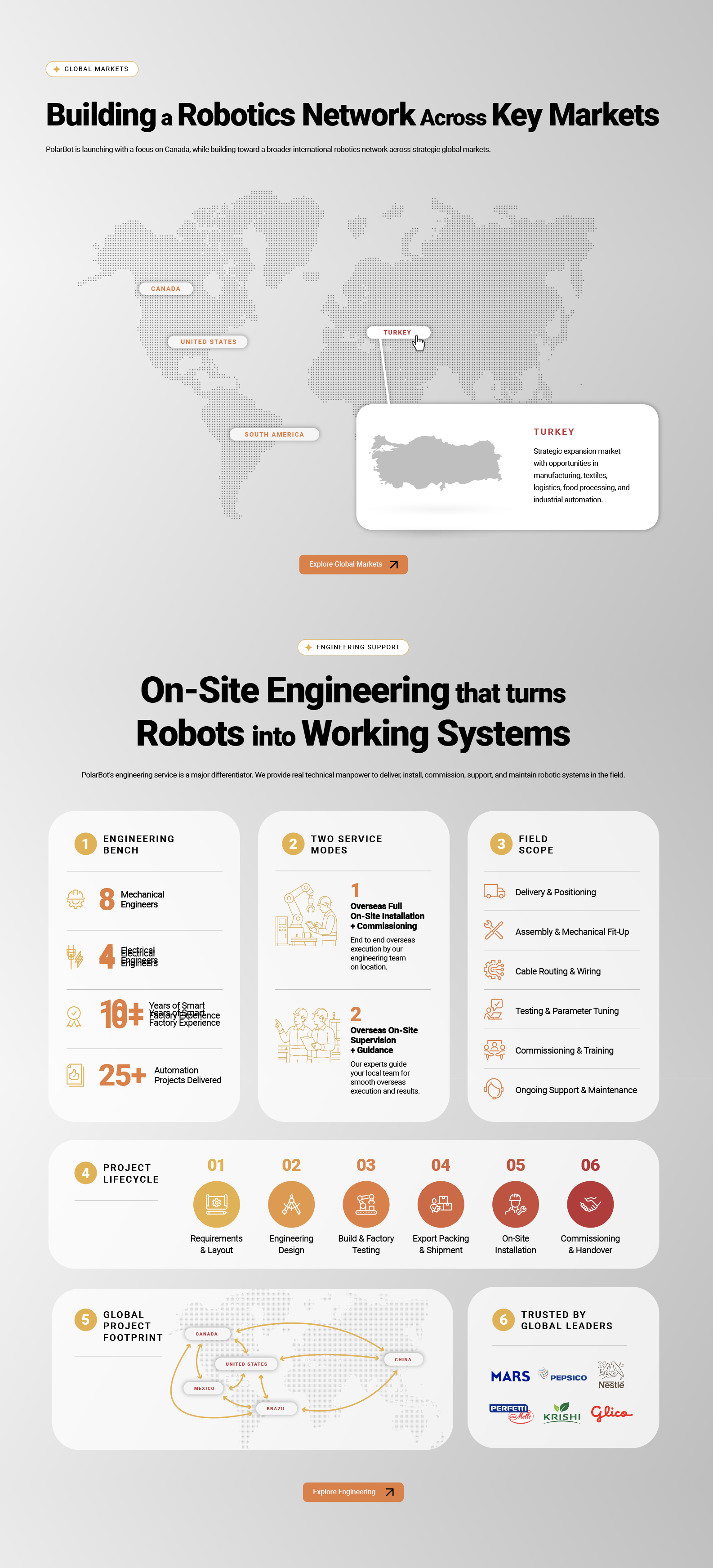
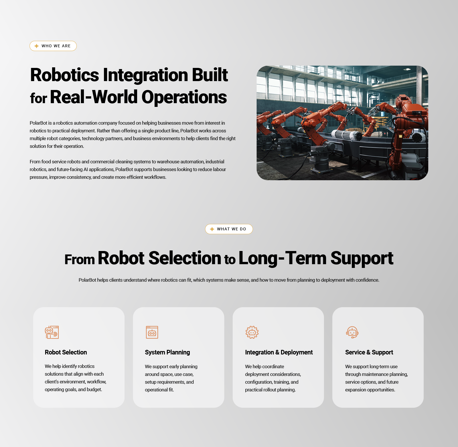
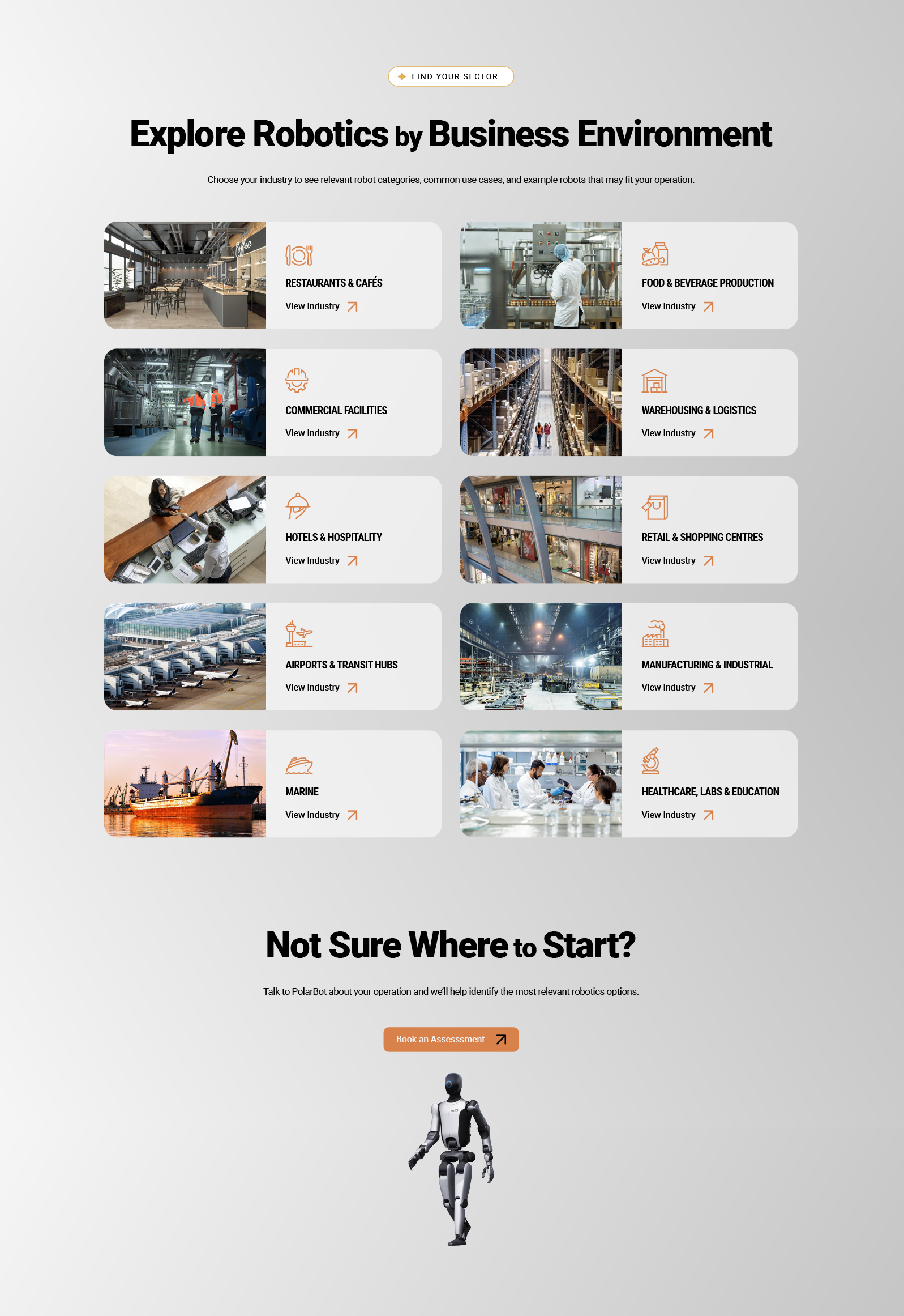
A website designed for PolarBot International, a global robotics integrator specializing in automation, artificial intelligence and robotic solutions across multiple industries. The design combines a clean, metallic aesthetic with the company's established colour palette, custom iconography and structured layouts to communicate its extensive range of technologies and services.
Modular content cards, infographics and carefully organized information help explain complex offerings, from industrial automation and logistics to engineering, deployment and ongoing support. The result is a cohesive digital experience that makes advanced robotics technology approachable to a broad business audience.



Measured Life | Web App & Interface Design
A web app concept designed to help users track personal goals, build habits and visualize their progress over time. The platform distinguishes between time-based activities (Measured Progress Time) and repeated actions (Measured Progress Count), providing flexible ways to measure achievement. A clean, minimal interface combines intuitive navigation, clear data visualization and rewarding progress indicators to make everyday goal tracking simple and engaging.

Angels West | Logo & Website Design
A brand identity and website developed approximately a decade ago for Angels West, an investment company connecting investors with opportunities in real estate, technology, renewable energy and emerging ventures.
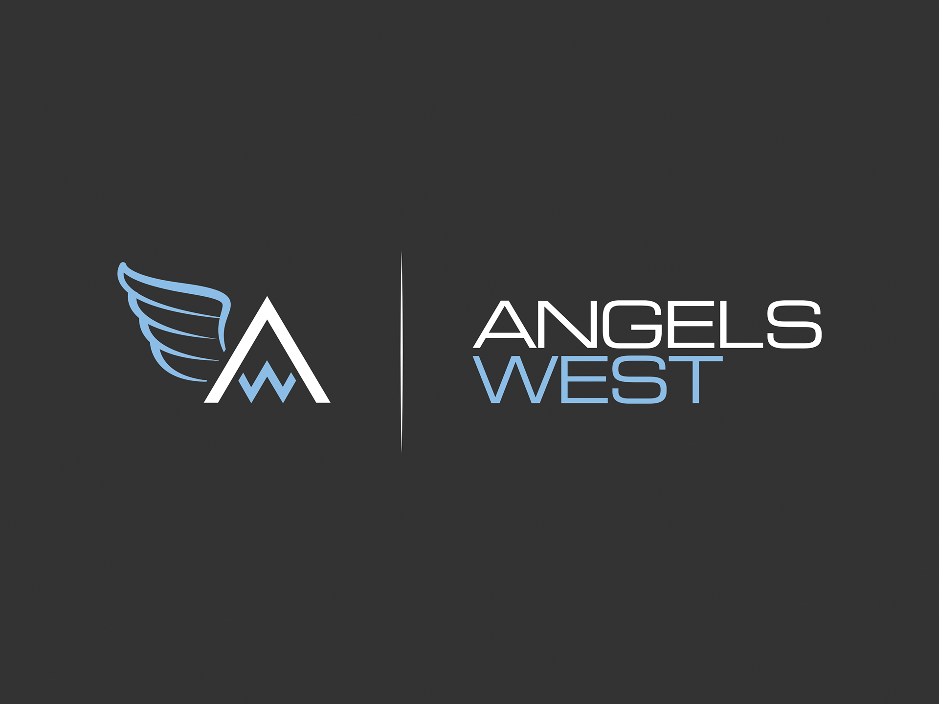
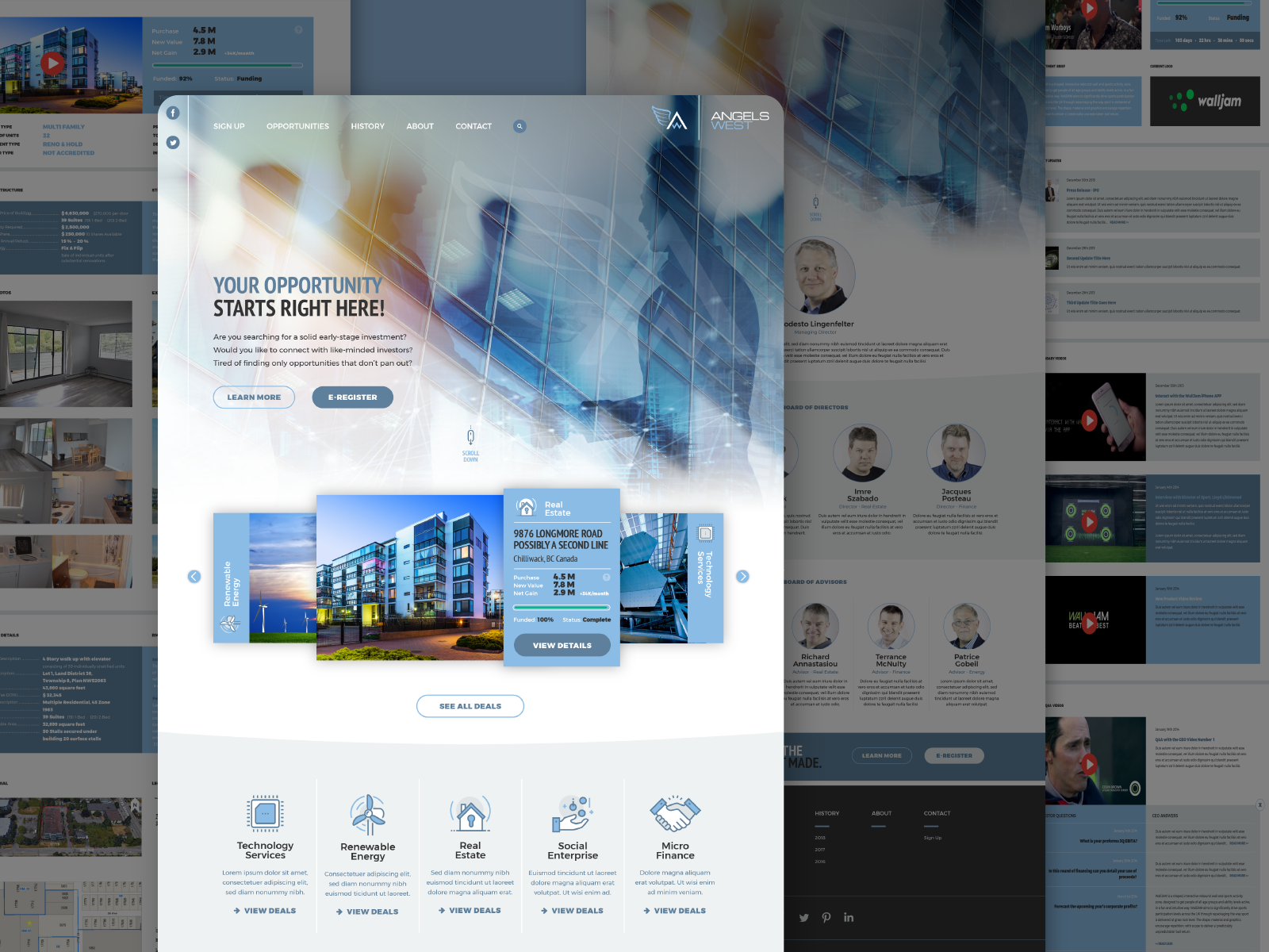
The custom logo incorporates a W into the crossbar of an A, with a stylized angel wing pointing west, cleverly combining both elements of the company name. The website features sweeping curves, a restrained blue palette, custom iconography and an unconventional navigation system. A prominent horizontal carousel allows individual investment opportunities to take centre stage.
Although the design is now a decade old, it remains a strong example of creative problem-solving, distinctive branding and thoughtful website design.